Designing a proof-of-presence platform that helps creators verify real-world transactions through a simple digital pass system.
Role: Product Designer Scope: User Flow, Wireframes, User Research, UI Design, Prototyping, Design System Tools: Figma Project Type: FinTech MVP
Project Overview
This FinTech MVP was designed to help creators, trainers, and service providers verify real-world participation and payments through a simple digital experience.
Many creators run in-person sessions where customers show up and pay physically. However, there is often no simple way to prove that a transaction actually happened. The platform solves this by allowing creators to share offers and generate a digital pass that acts as proof of presence.
As the Product Designer on the project, I worked closely with the founder to shape the product experience from early concept to a fully designed MVP. My responsibilities included defining the user flows, designing wireframes, conducting usability validation, creating the high-fidelity UI, building an interactive prototype to simulate the core product experience, and preparing a developer-friendly design system.
Problem
Many creators and trainers host in-person sessions but lack tools that prove a customer actually attended and paid. Existing platforms focus heavily on booking systems, scheduling, and complex setup processes.
However, the real need for creators is much simpler: a lightweight system that allows them to share an offer and verify that someone showed up and paid in person.
The challenge was to design an MVP that communicates this idea clearly while keeping the experience extremely simple and shareable.
Goal
The primary goal of the product was to design a simple experience that allows creators to quickly share an offer and verify real-world participation.
The product needed to enable creators to share a profile or offer link easily, allow customers to claim the offer with minimal friction, and generate a digital pass that confirms real-world participation. At the same time, the system needed to avoid complex setup steps that could slow down early adoption.
Design Process
The product was designed through an iterative process that combined structured design exploration with real user feedback.
My workflow followed this sequence:
User Flow → Mid-Fidelity Wireframes → User Feedback & Iteration → High-Fidelity UI & Design System → Interactive Prototype → Usability Testing → Final UI Refinement
This process allowed both the structure and the interface to be validated before finalizing the product design.
User Flow
Before designing the interface, I mapped the key user journeys to understand how the product should work from start to finish.
The platform has two primary user types: creators who host the sessions and customers who claim the offers.
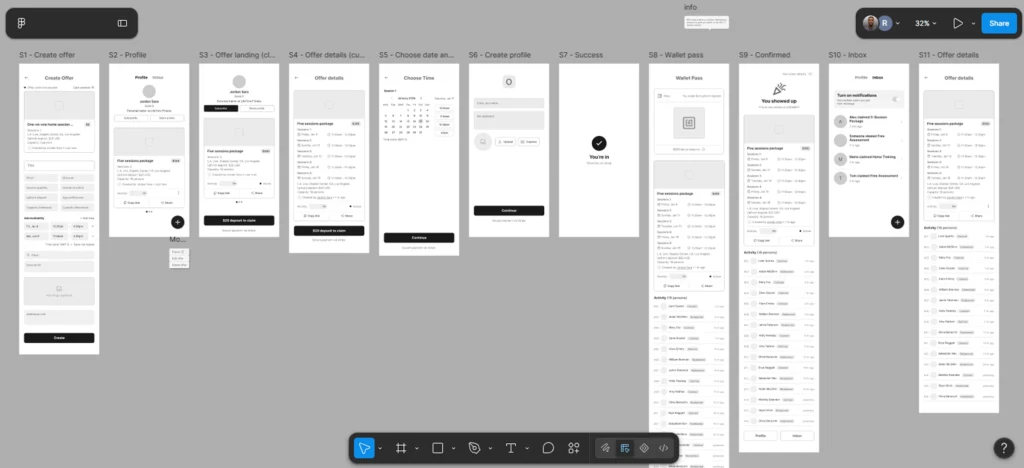
The creator flow focuses on creating and sharing offers, while the customer flow focuses on discovering an offer, claiming it, and receiving a digital pass.
Mapping these flows early helped ensure the product experience remained simple and intuitive.
Mid-Fidelity Wireframes
After defining the flows, I created mid-fidelity wireframes to explore layout, structure, and interaction patterns without focusing on visual styling.
This stage focused on validating the overall product structure, ensuring the flows felt logical, and identifying usability issues before moving to high-fidelity design.
Working in wireframes allowed rapid iteration and helped focus discussions on the experience rather than the visual design.
User Validation (Wireframe Stage)
To validate the product structure, I conducted a small usability review with two participants.
One participant was a regular gym member who frequently attends fitness sessions, and the other was a professional gym trainer who regularly hosts training sessions.
Both users were asked to complete the main flows: the creator flow and the customer flow.
Overall, both users were able to complete the flows successfully and felt the experience was easy to follow. However, a few clarity issues appeared during testing.
For example, the term “Upfront Deposit” was slightly unfamiliar, as users were more accustomed to the phrase “Advance Payment.” The label “Capacity” also required clarification, and users found “Members” easier to understand.
Another observation was related to time selection. One user selected a start time but was unsure when the session would end because the duration indicator was not immediately noticed.
These insights helped refine wording and improve visual hierarchy before moving to the final interface design.
High-Fidelity UI
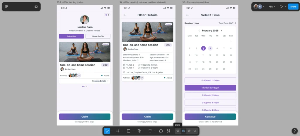
After refining the wireframes based on feedback, I designed the high-fidelity interface.
The visual design focused on clarity, simplicity, and identity-driven interactions. Creator identity remains visible throughout the experience, helping build trust and reinforce the social aspect of participation.
The interface was intentionally kept minimal so users could focus on the core actions: discovering offers, claiming them, and verifying participation.
Note: Due to client confidentiality, I’m unable to publicly share the complete set of screens.
Interactive Prototype
To simulate the real product experience, I built an interactive prototype covering the key product flows.
The prototype allows stakeholders and test users to navigate through the platform as if it were a real product, including browsing a creator profile, claiming an offer, and receiving a digital wallet pass.
Creating the prototype helped identify additional usability improvements before finalizing the design and ensured that both creator and customer journeys felt smooth and intuitive.
Design System
While designing the UI, I also created a lightweight design system to maintain consistency and make the product easier to develop.
The system includes typography styles, color tokens, button components, text fields, chips, cards, wallet pass components, and layout patterns. These reusable components helped maintain consistency across the interface while making the design scalable and easier for developers to implement.
Final Solution
The final product allows creators to share a simple profile link where customers can discover and claim offers.
Once an offer is claimed, the system generates a digital pass that confirms participation. This pass acts as proof that someone attended and paid in person.
The overall experience focuses on simplicity and shareability while still providing clear transaction validation.
Key Learnings
This project reinforced the importance of focusing on the core value of a product, especially when designing early-stage MVPs.
While exploring different design directions, it became clear that the real value of the platform was not complex booking systems or scheduling features, but proof of presence.
By focusing on that core idea and removing unnecessary complexity, the product became significantly clearer and easier to use.